


Responsive Web Design – Mobile-Friendly Websites That Adapt to All Screens
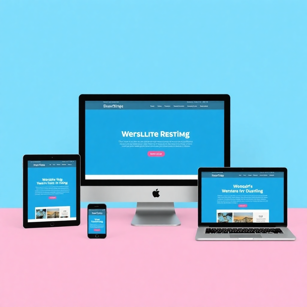
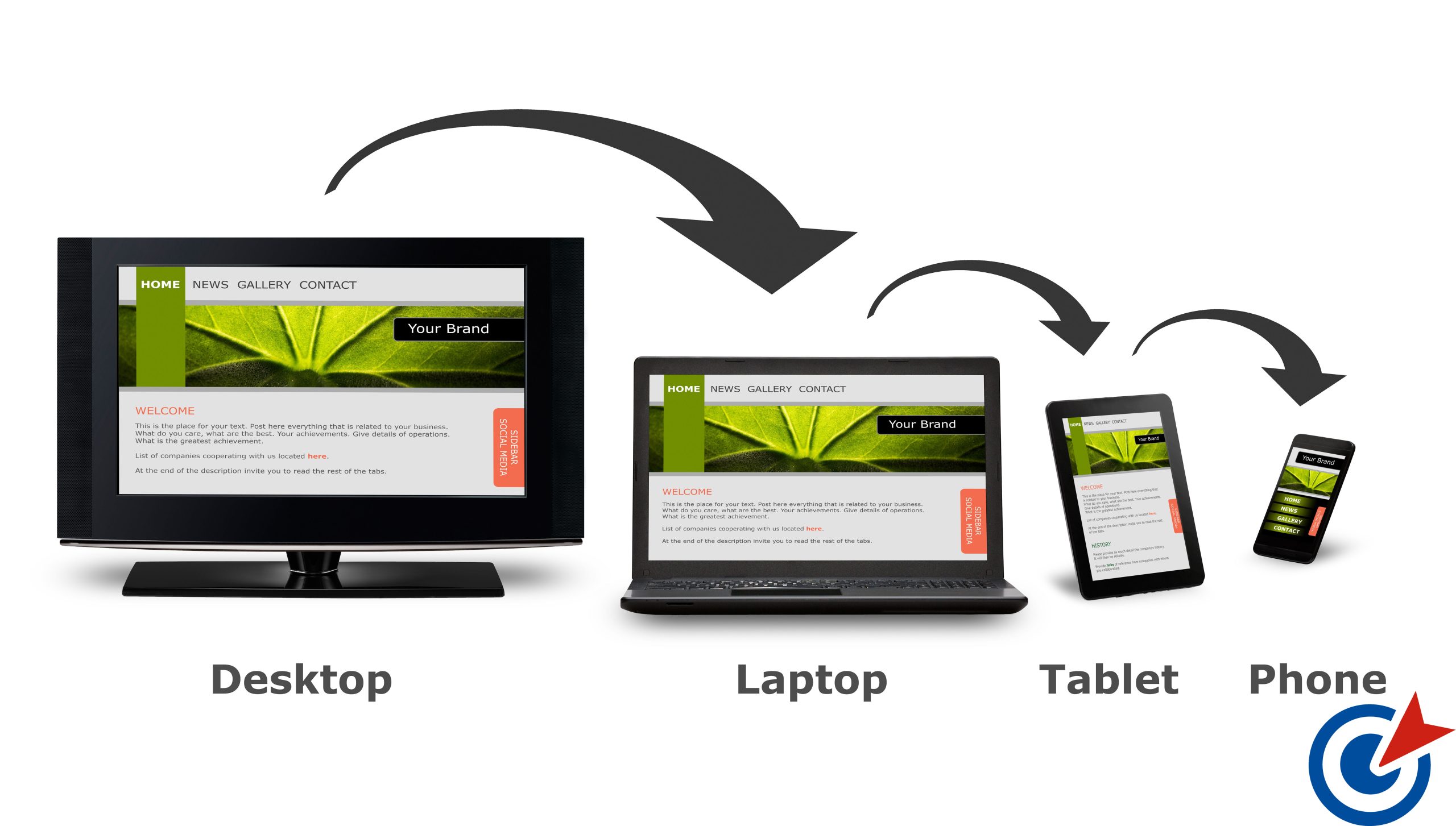
In today’s digital world, users browse websites from mobile phones, tablets, laptops, and large desktop screens. If your website does not adapt smoothly to every screen size, you risk losing visitors, leads, and sales. That’s where Responsive Web Design becomes essential.
What Is Responsive Web Design?
Responsive Web Design is a modern web development approach where a website automatically adjusts its layout, images, and content based on the user’s device and screen size. Whether someone visits your site from a smartphone or a widescreen monitor, the experience remains clean, readable, and user-friendly.
Why Responsive Web Design Matters
A responsive website is no longer optional—it’s a necessity. Here’s why:
- Mobile-Friendly Experience
Your website looks perfect on all devices without zooming or horizontal scrolling. - Better User Engagement
Visitors stay longer when navigation and content are easy to use on any screen. - SEO-Optimized Structure
Search engines favor responsive websites, helping you rank higher in search results. - Higher Conversion Rates
A smooth browsing experience increases trust and encourages users to take action. - Future-Proof Design
New devices and screen sizes are automatically supported without redesigning the site.
Key Features of a Responsive Website
A professionally designed responsive website includes:
- Flexible grid-based layouts
- Scalable images and media
- Mobile-first design strategy
- Fast loading speed on all devices
- Touch-friendly buttons and navigation
Who Needs Responsive Web Design?
Responsive design is ideal for:
- Business websites
- E-commerce stores
- Portfolio websites
- Blogs and content platforms
- Corporate and service-based websites
No matter your industry, responsive web design ensures your brand looks professional everywhere.
Our Approach to Responsive Web Design
We design websites that are visually appealing, fast, and fully responsive across all devices. Our focus is on user experience, performance, and SEO—so your website not only looks great but also delivers real results.
Final Thoughts
Responsive Web Design ensures your website adapts seamlessly to all screens, improves user satisfaction, and strengthens your online presence. If you want a website that performs perfectly on every device, responsive design is the smart investment.
📌 Ready to build a mobile-friendly, responsive website?
Let’s create a design that works everywhere and grows your business.