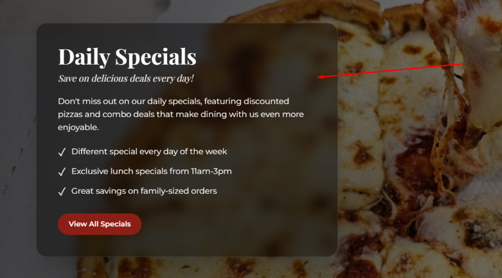

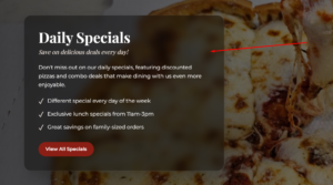
.glass-box {
background: rgba(0, 0, 0, 0.6); /* bg-black/60 */
backdrop-filter: blur(12px); /* Glass blur effect */
-webkit-backdrop-filter: blur(12px);
box-shadow:
0 25px 50px -12px rgba(0, 0, 0, 0.25); /* shadow-2xl */
padding: 2rem; /* p-8 */
border-radius: 1rem; /* optional: smooth corners */
}